Today we celebrate the 80th anniversary of the first publication of The Little Prince. On April 6, 1943, the first edition of the book was published in the United States, featuring illustrations created by the author, Antoine de Saint-Exupéry. The book tells the story of a young prince who travels from one planet to another, encountering various characters and learning profound life lessons along the way.
The Little Prince was met with immediate critical acclaim and gained a dedicated readership. Despite being initially published in wartime, it managed to capture the hearts of readers around the world with its enchanting storytelling and philosophical themes. It is important to note that the first publication of The Little Prince was in English, not in its original French language. The French edition followed later, published posthumously in 1946.
Since its publication, “The Little Prince” has become one of the most translated and best-selling books in the world, captivating readers of all ages with its poignant exploration of human nature, love, friendship, and the beauty of the imagination. It continues to be celebrated as a literary masterpiece and a cherished work of art.

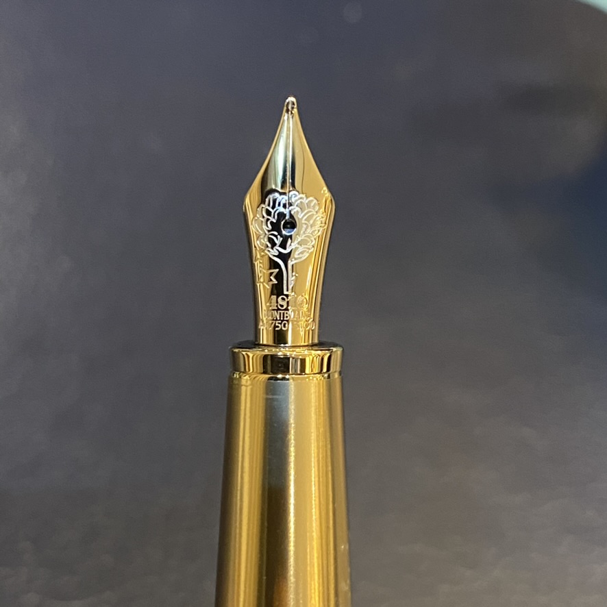
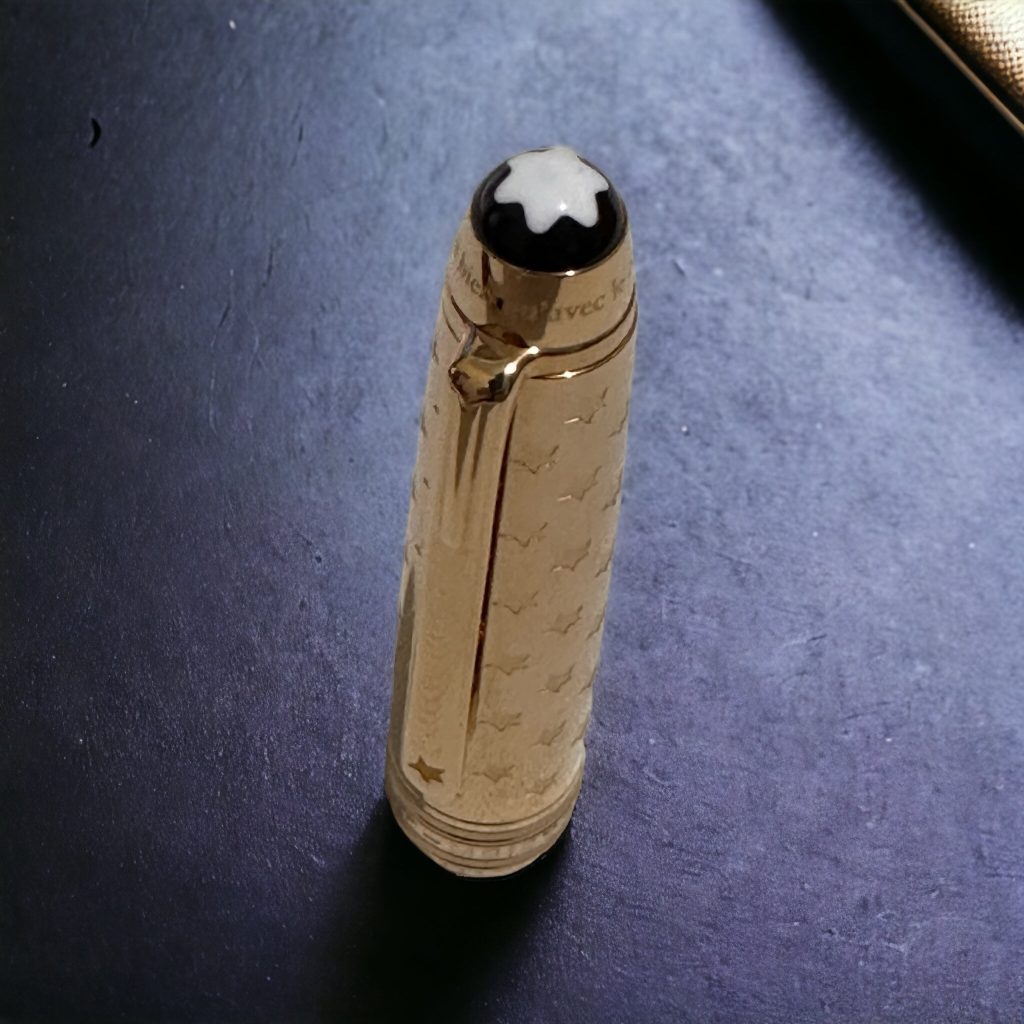
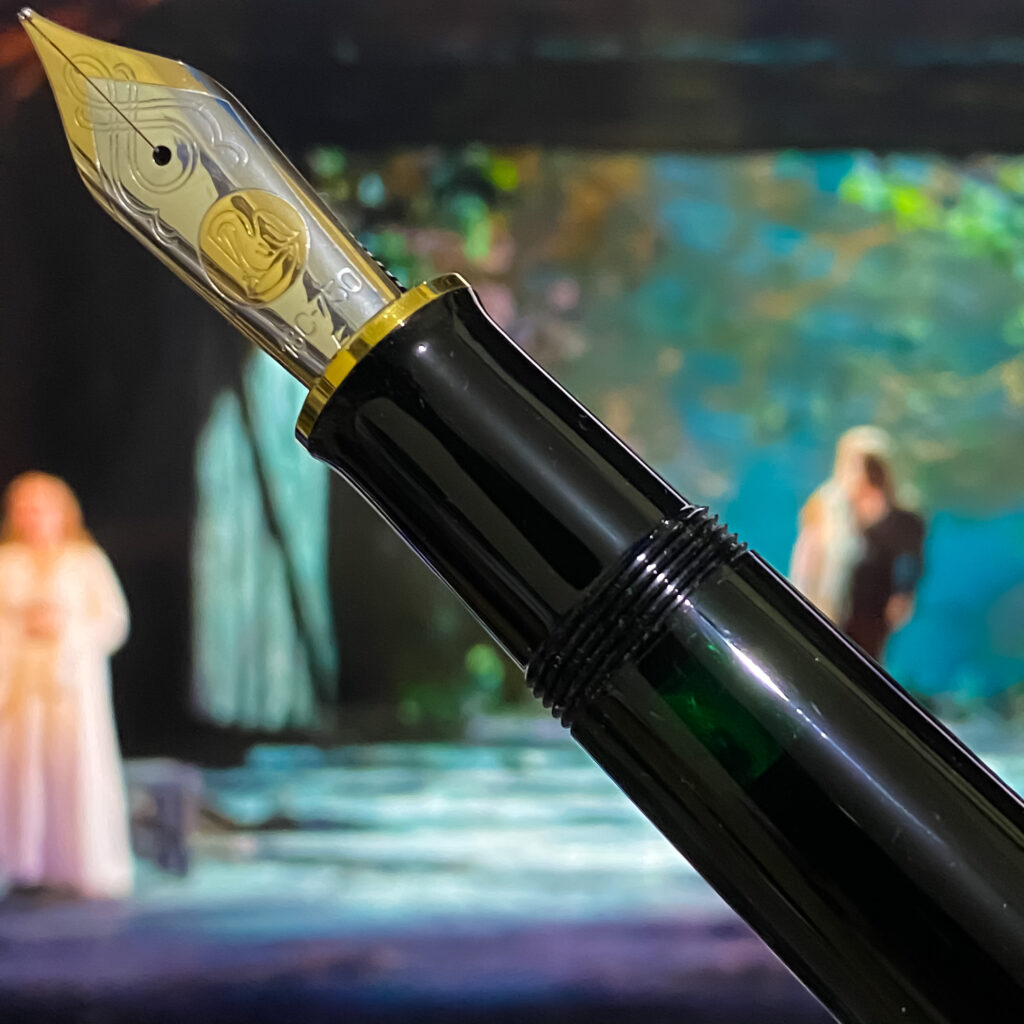
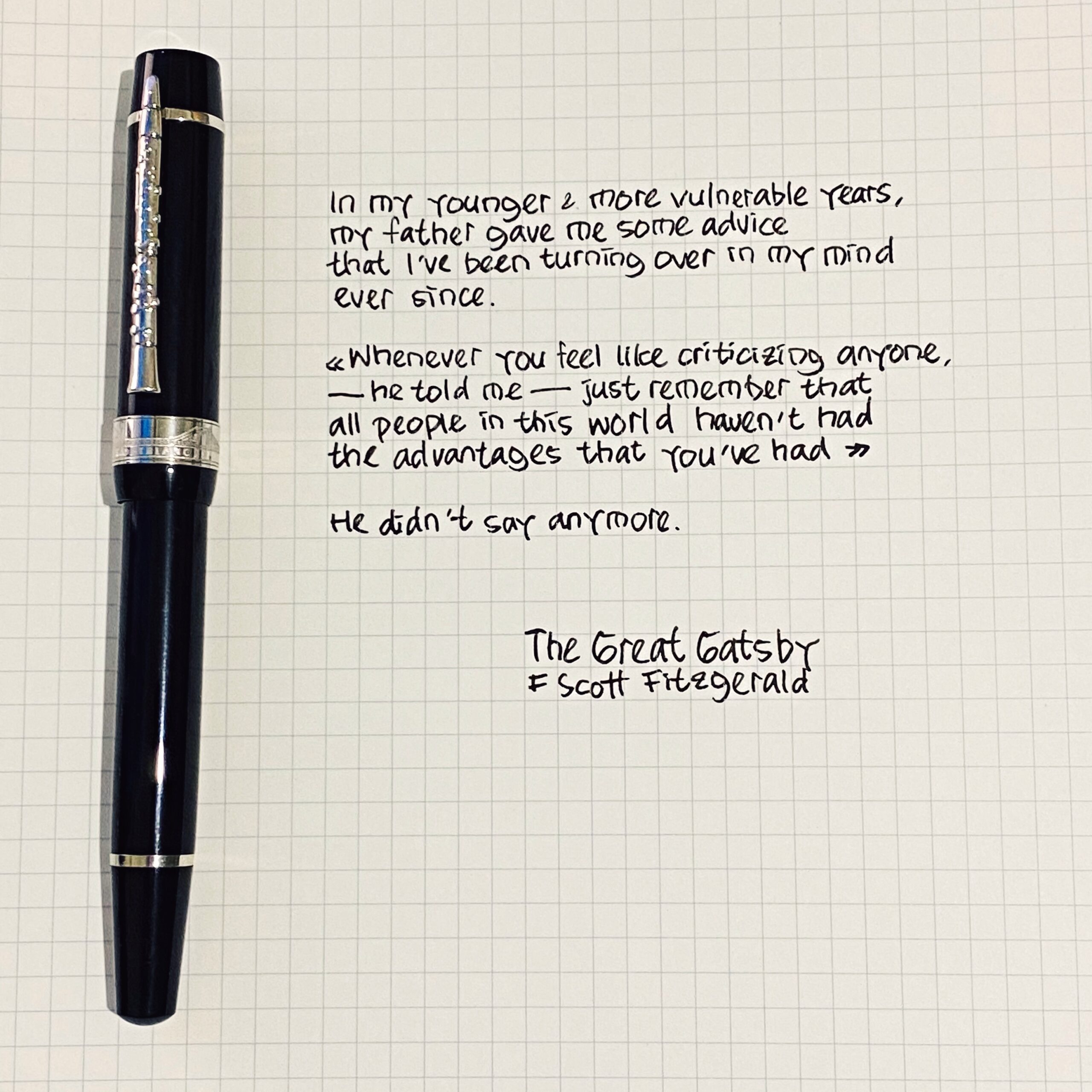
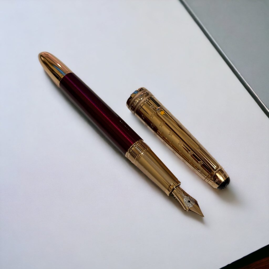
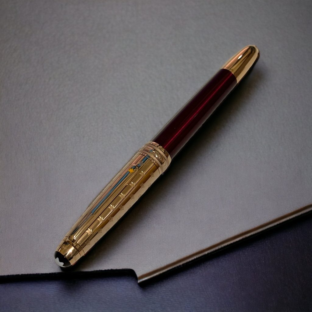
For the celebration, I display here a Montblanc Le Petit Prince series that I haven’t previously displayed. It is a special edition! The nib, made from Au750 (18K gold), is delicately engraved with the image of a rose. The rose holds significant symbolism in The Little Prince as it represents the bond between the Prince and his beloved rose. In the story, the rose is a delicate and special flower that teaches the Prince important lessons about love, responsibility, and the complexities of relationships. The rose engraving on the nib of this pen captures this iconic symbol, adding a touch of elegance and meaning to the writing instrument.